
Brand Identity & Packaging — 2024
Obsidian Coffee
A coffee brand with the gravity of stone.
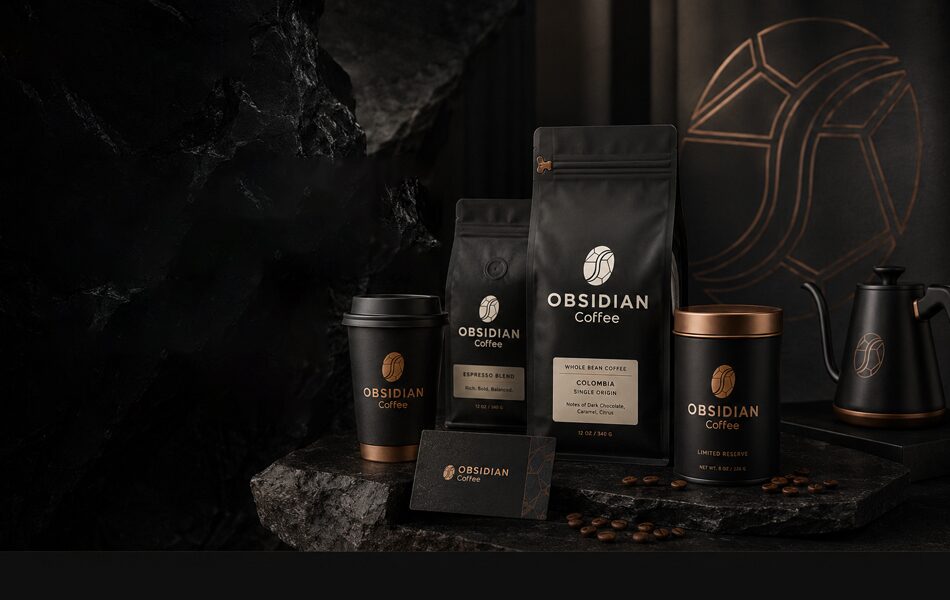
Overview
Obsidian is a small-batch roaster built on a single conviction: that coffee is a ritual, not a commodity. The studio developed a complete identity system — strategy, wordmark, packaging architecture, and voice — designed to hold its own in a category crowded with pastel friendliness.
Challenge
Speciality coffee shelves are loud. Obsidian needed to signal premium the instant it was picked up, without shouting — and to feel deliberate and quietly confident rather than cold or unapproachable.
Context
An audit of the category showed the same moves repeated everywhere: soft pastels, hand-drawn warmth, and busy origin storytelling. The opportunity was in the negative space nobody was using — restraint, weight, and silence.
Strategic Direction
We positioned Obsidian around a single idea: coffee with the gravity of stone. Every decision would earn attention through discipline, not decoration — a brand that reads as mined rather than designed.
Creative Concept
Volcanic glass became the governing material metaphor. It set the palette, the density of the letterforms, and the reverence of the layouts — a brand that treats a bag of coffee like a specimen worth handling carefully.
Design System
A near-black palette warmed by one ember accent; a high-contrast wordmark with the density of cut stone; and a typographic system that treats origin and roast data like a museum wall label — small, precise, and reverent. Space does the work most brands ask colour to do.
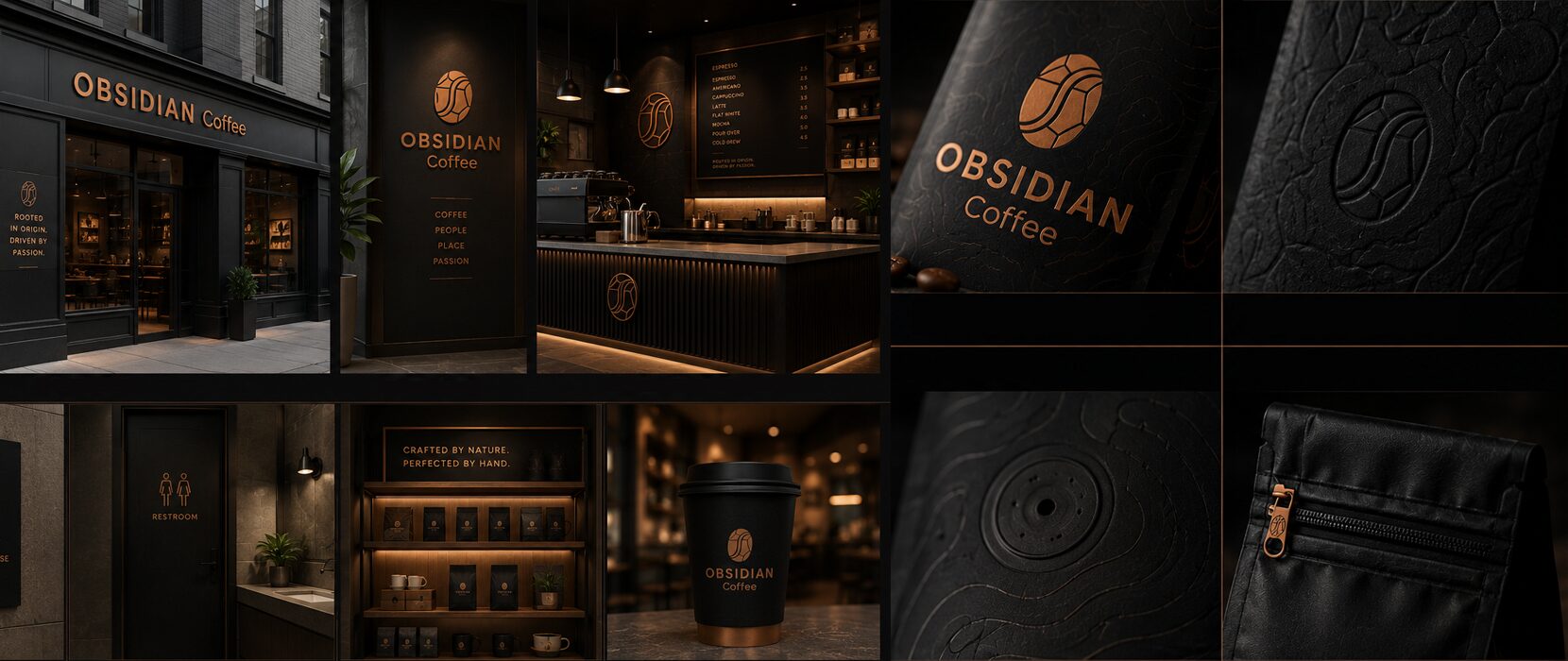
Applications
The system extends across bags, tins, café signage, and a digital presence that all share one unhurried tone of voice — proof that a single strategic idea can travel intact from the shelf to the screen.
Outcome
Obsidian reads as the most considered name on the shelf precisely because it asks for the least attention — a coherent brand system where identity, packaging, and voice pull in the same direction.
The full story
View the complete project on Behance