
Digital Experience — SaaS — 2025
FlowSync
An interface that disappears into use.
Overview
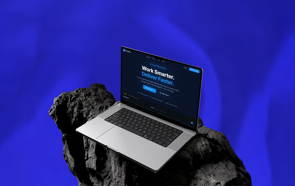
FlowSync is a productivity platform that had outgrown its own website. The product was sharp; the marketing site was noisy. The studio led a full redesign to make the brand feel as considered and calm as the software it was selling.

Challenge
The existing site buried a genuinely elegant product under gradient soup and feature lists. Prospective customers could not feel the calm the software delivered — the brand's first impression contradicted the product experience.
Context
The product's real strength was restraint: it removed friction rather than adding features. The website was doing the opposite, so the redesign started from the product's own logic rather than category convention.
Strategic Direction
Make legibility the brand. If the site could lower a reader's pulse the way the product lowered a team's workload, the marketing and the experience would finally tell the same story.
Creative Concept
"The interface disappears into use." Every screen was designed to make exactly one thing clear at a time, so the reader is never managing the page — they are simply understanding it.
Design System
A strict typographic hierarchy, generous whitespace, and motion used only to clarify — never to perform. The system was documented as a durable, restrained toolkit the team could extend without losing the calm.
Applications
Marketing pages, product-marketing modules, and a component library share one set of rules, so future pages inherit the same composure instead of drifting back toward noise.
Outcome
The redesigned site reads the way the product works — quietly, confidently, without friction. The interface gets out of the way, which was always the point.
The full story
View the complete project on Behance